

Bootstrap 5.3.0
It’s official, the final stable release of v5.3.0 has landed! It’s been a monumental effort to revamp our codebase for CSS variables and color modes, one that will see continued changes leading up to an eventual Bootstrap 6. And we’re so excited to finally ship it!
On top of all the work that’s gone into this release, a lot has happened behind the scenes since we shipped our pre-releases. Keep reading to learn everything that’s new in v5.3.0.
What’s new
- Dark mode support
- Custom color modes support for themes beyond light and dark
- Extended color palette for theme colors that adapt to color modes
- New link helpers, link utilities, and focus ring helpers
- New nav underline variant
- Several new utilities, bug fixes, and much more!
Keep reading for the deep dive on all the top new features.
Dark mode
Bootstrap’s core has been rewritten to provide first-class support for dark mode. Moreover, Bootstrap now supports any number of color modes, allowing you to build your own custom themes or more nuanced color modes. Let’s take a look at how our new dark mode works first.
Bootstrap’s new dark mode is opt-in by default, meaning you’ll need to set a data-bs-theme attribute on the root <html> element to change the entire page’s design. This was done to best support custom color modes beyond light and dark—more on that later. It also helps folks who aren’t ready for dark mode in their own designs.
<!doctype html>
<html lang="en" data-bs-theme="dark">
  <!-- ... -->
</html>
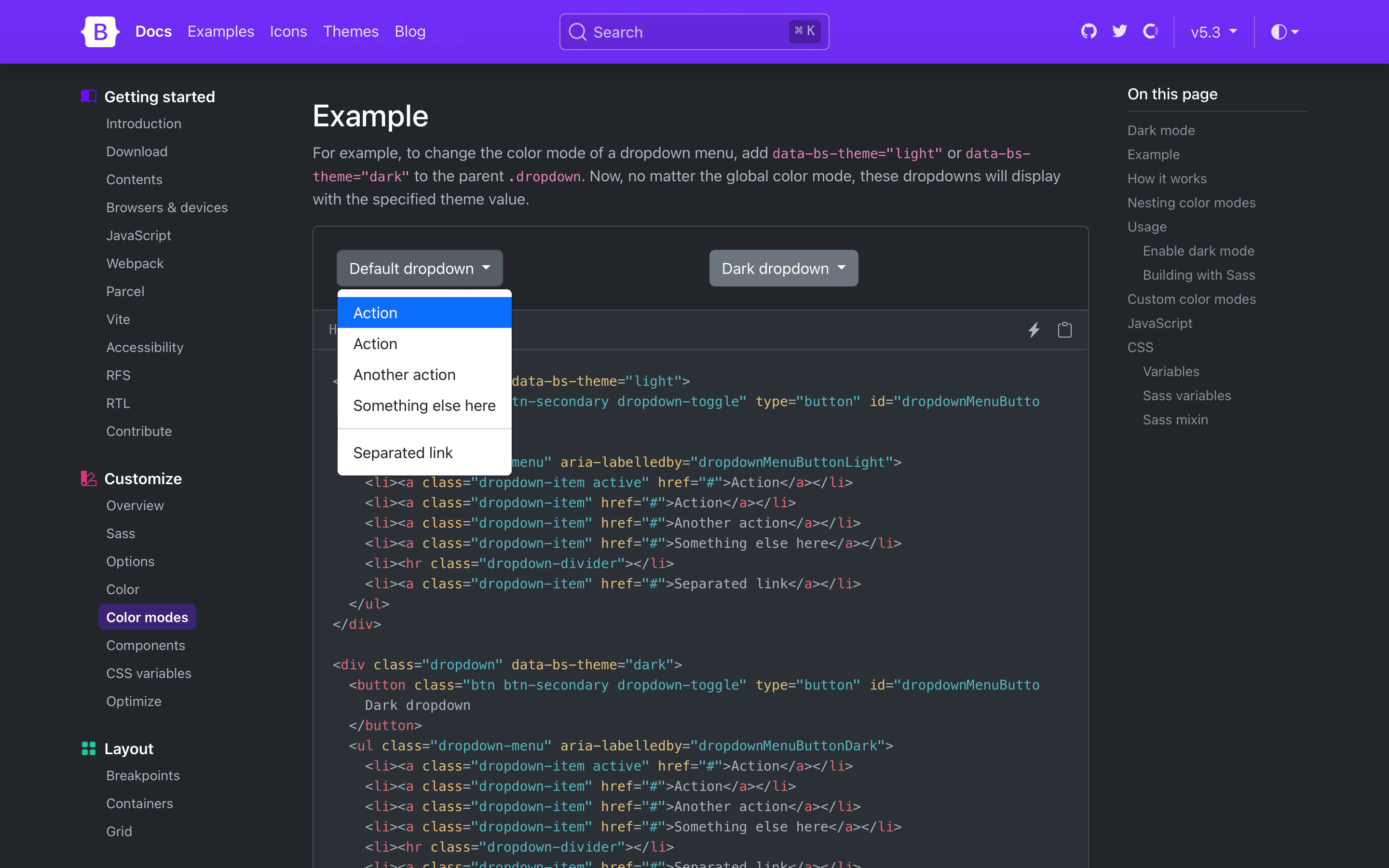
Need a more isolated dark mode? You can also set the color mode on a parent element like the .dropdown shown below. This will only affect the dropdown and its children instead of the entire page.
New color-mode() mixin
Dark mode styles are written with and generated through the new color-mode() Sass mixin. The mixin allows you to write styles specific to a particular color mode, like dark mode.
@include color-mode(dark) {
  .element {
    color: var(--bs-primary-text-emphasis);
    background-color: var(--bs-primary-bg-subtle);
  }
}
Together with the new $color-mode-type Sass variable, you can also change how color modes behave in Bootstrap. The default value is data, which tells Bootstrap to generate CSS selectors that scope the color mode’s styles to the data attributes you’ve seen above.
The other supported value is media-query, which generates media query selectors instead. This is helpful for those who want light and dark modes, automatically, and without a user override.
$color-mode-type: media-query;

@include color-mode(dark) {
  .element {
    color: var(--bs-primary-text-emphasis);
    background-color: var(--bs-primary-bg-subtle);
  }
}
Which outputs to:
@media (prefers-color-scheme: dark) {
  .element {
    color: var(--bs-primary-text-emphasis);
    background-color: var(--bs-primary-bg-subtle);
  }
}
Read the new color mode docs to learn more.
Toggling color modes
While we haven’t written a new JavaScript plugin for toggling color modes, we’ve written a great script for toggling color modes via data-bs-theme in our docs. Our implementation defaults to a user’s operating system color mode (auto), but also allows users to override that with a particular mode (light or dark) that’s recorded in local storage for easy reference on future page loads. You can use and adapt this script as needed.
New color mode variables
There’s also a new _variables-dark.scss stylesheet that houses dark mode-specific Sass variables. This is where we modify mostly global values, and some component-specific values, for dark mode. We recommend creating separate Sass stylesheets for additional custom color modes (e.g., a blue theme might have _variables-blue.scss). We expect this stylesheet to be simplified in our next major release as we continue to streamline the code base.)
Dark mode colors are all derived from our theme colors, meaning you can easily change the color mode palettes by updating the original theme colors. This means we’re not using our already tinted and shaded colors (e.g., shade-color($danger, 60%) instead of red-800 for the new danger emphasis color).
Bootstrap v5.3.0 ships with dark mode enabled, but you can also disable it by updating the boolean $enable-dark-mode Sass variable.
Read more in the new color mode docs.
Enabling dark mode
If you’re using the CDN or starter template, using the new color modes is straightforward. Add the data-bs-theme attribute with light or dark values to the <html> element and you’ll be using either the light or dark theme.
<!doctype html>
<html lang="en" data-bs-theme="dark">
  <head>
    <meta charset="utf-8">
    <meta name="viewport" content="width=device-width, initial-scale=1">
    <title>Bootstrap demo</title>
    <link href="https://cdn.jsdelivr.net/npm/[email protected]/dist/css/bootstrap.min.css" rel="stylesheet" integrity="sha384-9ndCyUaIbzAi2FUVXJi0CjmCapSmO7SnpJef0486qhLnuZ2cdeRhO02iuK6FUUVM" crossorigin="anonymous">
  </head>
  <body>
    <h1>Hello, world!</h1>
    <script src="https://cdn.jsdelivr.net/npm/[email protected]/dist/js/bootstrap.bundle.min.js" integrity="sha384-geWF76RCwLtnZ8qwWowPQNguL3RmwHVBC9FhGdlKrxdiJJigb/j/68SIy3Te4Bkz" crossorigin="anonymous"></script>
  </body>
</html>
Custom color modes
When we set out to add dark mode support to Bootstrap, we didn’t want to just add a dark mode. We wanted to build the foundations for a color mode system that could be used to create any number of themes and color modes. That’s why we lead with the data-bs-theme attribute and the new color-mode() Sass mixin, and why we’ve added so many new CSS variables in these latest releases.
To add a custom color mode, create your own data-bs-theme selector with a custom value as the name of your color mode, then modify any Sass and CSS variables as needed. We created a separate _variables-dark.scss stylesheet to house Bootstrap’s dark mode-specific Sass variables, but that’s not required for you.
For example, you can create a “blue theme” with the selector data-bs-theme="blue". In your custom Sass or CSS file, add the new selector and override any global or component CSS variables as needed. If you’re using Sass, you can also use Sass’s functions within your CSS variable overrides.
Heads up! Applying color modes to elements that aren’t the <html> or <body> elements requires classes like .text-body and .bg-body. This is because many HTML elements have no set color or background to style until you add them yourself. We’ve included them here for you just in case.
[data-bs-theme="blue"] {
  // CSS variable overrides and styles
}
<div data-bs-theme="blue">
  ...
</div>
Refreshed color palette
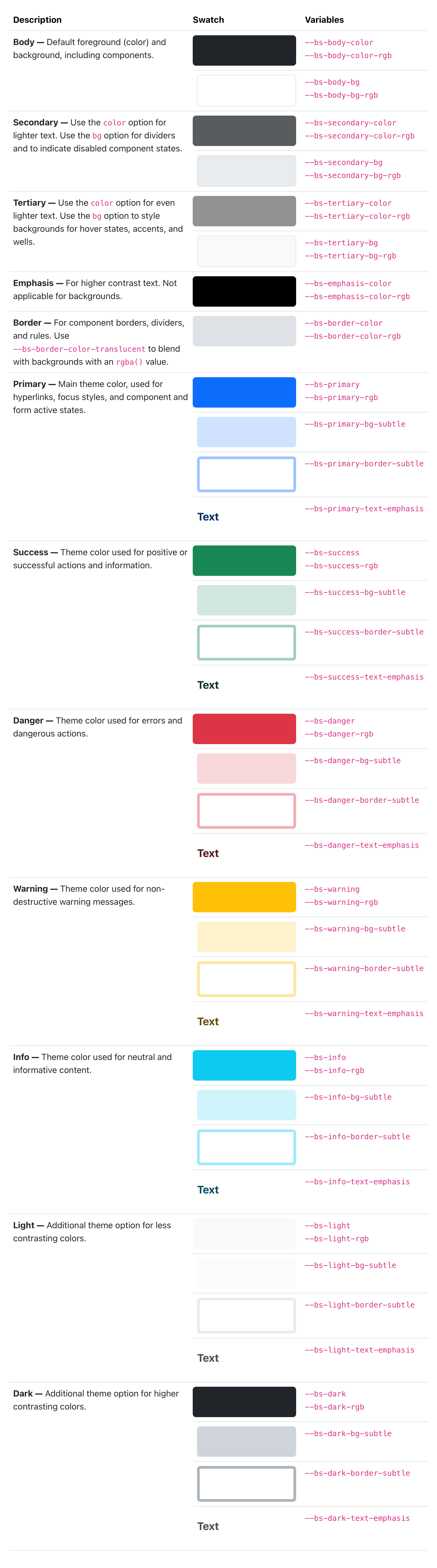
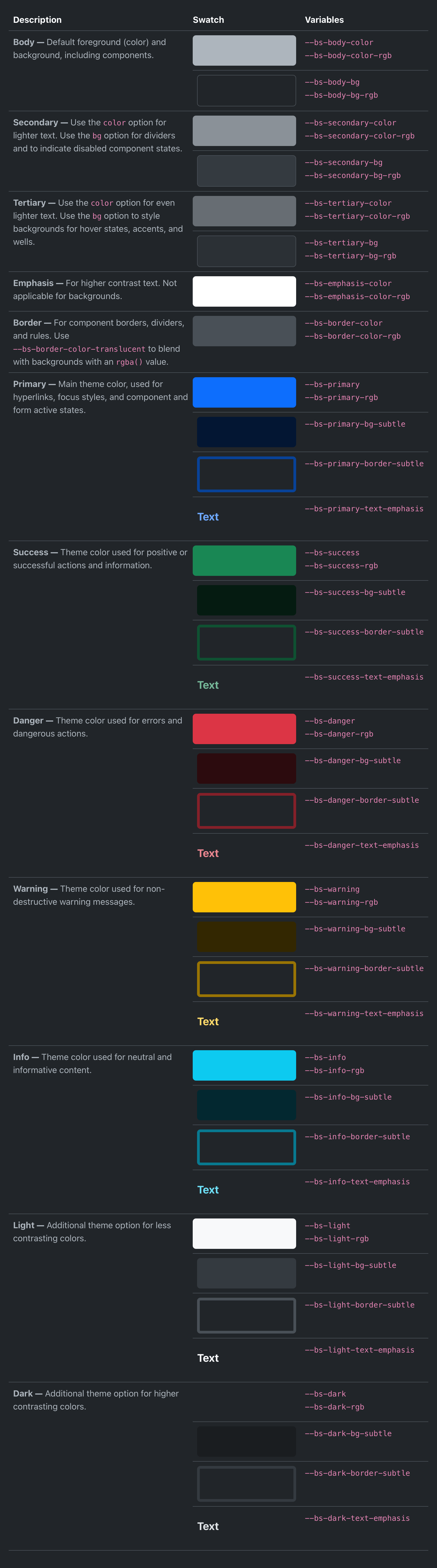
We’ve revamped our color palette to include all new Sass variables, CSS variables, and utilities for setting color, background-color, and border-color. Our foreground and background colors have been expanded to include new secondary, tertiary, and emphasis colors, while our theme colors have been expanded on to include their subtle background colors, subtle border colors, and darker text colors.
Check out the new colors docs.
We’ve rebuilt some components (like list groups and alerts) to use these new variables in their source Sass and compiled CSS so that they respond to the color mode changes.